Orange is a wonderfully happy and inviting color! It is associated with meanings of warmth, vibrancy, joy, creativity, fun, freedom, and sunshine. This fresh color can also be a wonderful enhancement to home interiors. However, in order for the hue to work, it is important to create balance with the color in your interior spaces. I discovered many clever inspirations that I know you will love and maybe encourage you to put a little warmth and joy in your space with the color orange.

One clever way to display orange is to simply add it to the framing of your favorite artwork. The orange is not too intrusive and it is incredibly striking! The hue pops wonderfully against the deep brown walls. The fresh blue also works so well with the browns and oranges. What a wonderful vignette.

Vern Yip is a master of color. He displays a lot of orange in his interiors. The beautiful draperies are distinctive and cheerful. The geometric circles around the room in different orange shades are quirky and charming. Yip ties the orange brilliantly with the browns and creams, anchoring it with the delightful large black shades.

Orange is used all across this charming bedroom. You will find splashes of orange on the beautiful geometric patterned throws as well as on the toile pillows. It can be found on the handsome trim on the benches and the lovely cozy chair covered in a beautiful orange fabric.

A perfect way to add splashes orange, maybe with some Hermes boxes and deep orange pillows and lampshades! This deep, sexy orange is breathtaking with the deep charcoal grays.

Celticin Interiors used a fresh coat of orange to spice up this kitchen island. The orange is a perfect balance against the black cabinet and stainless steel appliances. The color used by Celticin is called Charlotte’s Locks by Farrow and Ball. This hue is a fan favorite and a lively, pleasing orange.

I love this Asian-style piece painted in a high-sheen orange. What better way to spice up a room than paint a piece of furniture a bright, fun orange?

Benjamin Moore’s Orange Parrot makes a perfect shade for this attractive cocktail bar area. The paint is done in high gloss, which adds to the charm and sophistication of the space. The wallpaper is enchanting and the parrot artwork tie this space together wonderfully!

Orange, like red, is known to be an appetite enhancer, so it could be a perfect choice for kitchen walls. The walls are perfect with the handsome black and white floor in this charming little kitchen.

If you look at this room closely, you will see that it is a mostly white space with just a few pops of orange. The little pops of orange, however, make a big statement. The throw, pillows, and orange tray are perfectly placed across the room and the orange backdrop in the shelving unit is stunning.

Orange can work beautifully on doors. This color is Charlotte’ss Locks from Farrow and Ball and it is gorgeous against the gray bricks. Orange is a joyful, inviting color so it is a perfect option for the front door!

This bathroom is delightful in orange and cream stripes. I love the wider stripes, they make such a spectacular impact. I also adore the charming roman shade in this lively hue!

Noushka Design does such a wonderful job placing splashes or orange around this fun room. What a delightful idea to spice up a fireplace with a great coat of Farrow and Ball’s Charlotte Lock’s. She also added the same hue to the backdrop of the built-in shelves. She completed the look with cheerful pillows and an amusing orange gorilla lamp.

What a fun design idea to paint orange inside the kitchen cabinets. Patrick Sutton used Electric Orange as his chosen shade. It would be such an enjoyable surprise to open your kitchen cabinets to such a fun color.

A few splashes of orange can be wonderful as part of a table setting. This Ken Gemes-designed tabletop is so cheerful and the coral orange lanterns are the perfect finishing touch.

Orange makes a delightful accent wall color. This modern bedroom is fabulous with one wall painted orange and a few pops of orange on the cozy bed. The hue works so well in a contemporary setting.

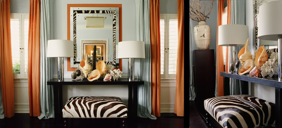
Mary McDonald utilizes orange in many of her designs. She works the hue into this space so beautifully against the zebra prints and black furniture. The white panels with the splashes of orange sheers are sumptuous. She uses the same shade of orange of the sheers to frame the mirror, as well as more zebra stripes. It is an opulent balance from this world-famous designer and brilliant use of this fantastic color.
I hope you enjoyed these magnificent designs and are inspired to use more orange in your interiors! Please share any of your own inspirations in the comments.

