
Orange has this amazing energy—it’s warm, cheerful, and instantly makes me smile. It’s the color I always connect with fall, which just happens to be my favorite season. So many little things I love come in orange: glowing sunsets, crunchy autumn leaves, cozy firelight, and even the juicy sweetness of citrus.
Emotionally orange is tied to playfulness and creativity, transformation, vitality and enthusiasm. Visually, it can bring richness and boldness into an interior space. The shade must be used wisely and usually in more as a pop or accent in a space. Not to say, it can’t be used in a bigger way but it is a perfect color for an accent wall, studios, playrooms and a small powder room. I don’t recommend orange as much in bedrooms, because it can affect restfulness. Also, I don’t recommend the color in rooms with little or no light, can make these vibrant oranges overly intense.
Here are a few of my favorites from Benjamin Moore Paints

Benjamin Moore Electric Orange (2015-10) “is a vibrant, energetci and lush orange color. It is part of the Color Preview Collection.” It pairs well with cool grays or blues. Benjamin Moore recommends Old Navy or Distant Gray and also agrees it would be a perfect accent wall for dining room or bar area. It would also be perfect for a painted piece of furniture to add a pop to any room.

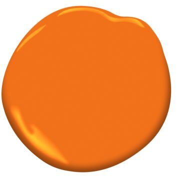
Benjamin Moore 2015-20 Orange Burst “is a bold, high-spirited orange paint color from the Bemjamin Moore Color Preview Collection. Known for its ability to brighten and energize spaces like playrooms, it can be used on a variety of surfaces including walls, trim, doors, and cabinets.”
Benjamin Moore recommends it for playrooms and other lively areas! It is energetic and bright. They also recommend pairings with Black Rasberry and Cancun Sand.

Benjamin Moore’s Festive Orange (2014-100) is “a vibrant, youthful orange that sets a celebratory mood from the Color Preview Collection” It is the perfect hue for creative work spaces and studios. It was also be perfect in a powder room or on kitchen cabinets. Benjamin Moore recommends it to be paired with

Fireball Orange (2170-10) is “a charged orange-red with an attention grabbing flair and part of Benjamin Moore’s Color Preview collection.” This tint would be perfect for an accent wall in a dining room or living room. It would also be perfect in a small kitchen nook. It would also be agreat accent on the exterior of a home including doors or shutters. Benjamin Moore recommends it be paired with Simply White and Southern Vine.

Orange Juice (2017-10) is a youthful, feel-good shade of orange that energizes the room” It is part of Benjamin Moore’s Color Preview Collection. Orange Juice would be a beautiful color in a dining room and a kitchen as orange encourages socialbility and appetite. It isn’t quite as intense as some of my other picks, so it could be used in a larger space. According to Benjamin Moore, It pairs best with Linen White and Thicket.
Benjamin Moore’s most vibrant orange paints each offer a distinct approach to warmth and energy in interior design. These shades go beyond simple color — they infuse rooms with optimism, creativity, and warmth.Whether creating a bold accent wall, brightening a cozy nook, or elevating a creative space, these shades balance personality and versatility. They work beautifully with natural materials, crisp neutrals, and warm lighting, making them ideal choices for both expressive statements and curated palettes. Each brings a touch of joy that never goes unnoticed.