As a designer, I get the question all the time, “What do I do with this awkward space?” One of the trickiest spaces in the home can be underneath or beside the staircase. However, this area can be very usable and beautiful. I hope you enjoy these fine examples from some of my favorite designers.
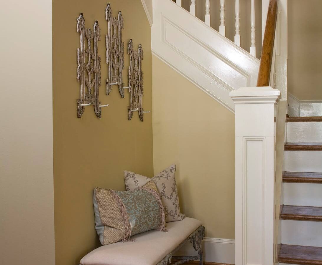
The featured image above was an under-the-steps area we personally designed for a local client. It is truly awkward, small, and seemingly unusable. These particular clients also have a home in New Orleans, therefore they love an old French look! We reupholstered an antique bench and reutilized some French architectural pieces and made usable coat hangers. The space now has purpose and beauty!

The space right beside the stairway angle can be a problematic area but Allison Baker Interior Design cleverly utilized the space. The mirror above the chest is the perfect size and height. I love this magnificent chest with tons of storage in the wide drawers. There is also plenty of room on top to display favorite showpieces. The bowl is gorgeous! Bowls and boxes can also be the perfect place for guests to put their keys and small belongings. The delightful white side chair is lovely beside the natural wood and also provides usable extra seating.

The little nook on a split staircase can become an unattractive dead space but Carolyn Brackett Design designed a wonderful little vignette. The blue lamps are a fun pop of color against the white shiplap. The console provides a nice surface for favorite books and displays. I love the idea of having an extra bench for seating tucked under the piece. The shape of the bench is so quirky and delightful.

First of all, I love this staircase and the open concept of this entire area. The little nook underneath the staircase could be easily overlooked. There is very little space! Crumbs home crunched that problem and effortlessly made the space work! The entire space works off the natural sunlight and open concept. The rattan bench is a perfect size and adds to the organic nature of the space. I love the house plant in the corner bringing nature right inside and the little white table is the perfect added touch. This little space actually feels like a room addition to the house!

First off, this chest is perfection! What a display piece to put right underneath steps. I love the veneer in the drawers and the charming legs on this piece. The white chair and the white lamp are the perfect offset to the heavier feel of this showpiece chest, letting it have its dominance in the space. If you actually observe the area, there is really not much surface space at all but Park and Oak designed the perfect vignette and it is a showstopper!

This rounded, angled foyer could easily be ignored but this designer utilized every little inch in this darling space. The antique plate display worked charmingly up the odd-shaped wall, circling around the mirror. The chalk-painted console is not big but provides ample space for books, a lamp, and a gorgeous bowl. The basket for storge needs tucks perfectly underneath. The chinoiserie-painted chair is a perfect seating addition to the space and can easily be moved around for extra guest seating.

I love this area featured in Better Homes and Gardens! It combines old French with a modern flair. I love the size and coziness of this beautiful Bergere settee. The zebra fabric and pops of color add charm and modernity to the space. The quadrille-shaped small side table is perfect beside the settee. The rug brings it all together and makes the space that creative, fun, and serviceable.

It would be super easy to just leave this shiplap wall blank and not think twice about it. After all, it is a beautiful touch all by itself however, you wouldn’t have all this amazing decor to walk by on a daily basis! The natural wood elements of the bench, plants, and tables bring the outdoors in and all the way down the hallway. The cozy pillows and throw bring delightful warmth and the rug ties it all together.

It is so easy to ignore a small space like this wall area but what an impact it can make in your home. This was just enough space for a lovely demilune chest and an ornate mirror but what a huge impact. This gem of a lamp adds such warmth and an inviting feel to the entrance. The chest provides extra storage and the rounded shape doesn’t take up a lot of space. I am a sucker for a gilded mirror which makes this small entrance seem grand. And is there anything more refreshing than a vase of flowers?

House Beautiful featured this delightful nook under the stairs. Covered tables are always in style if done correctly! I love the geometrical elements of the stair runner and the wide band at the bottom of the table skirt. The large surface area of this table provides plenty of space to put treasured collectibles. The box can be used to hide car keys and wallets, etc. And the homeowner took advantage of the small space above the table for a wonderful display of art.
We hope you enjoyed these under the steps ideas and pictures. What seems like wasted space can really be turned into a beautiful space for your home. What are your favorites and please share some of your own ideas that might be featured here on my blog! Happy creating!

